来源:广告记
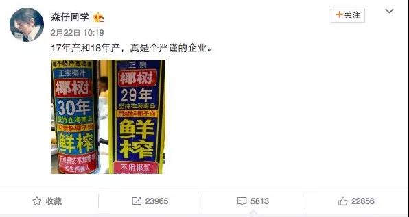
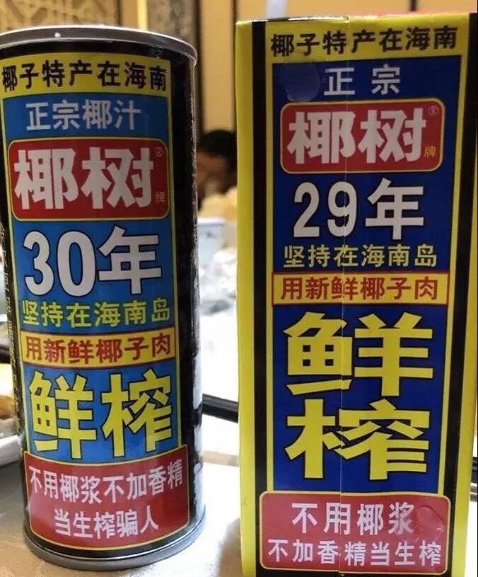
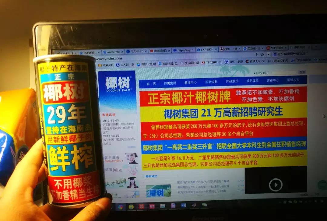
椰树牌椰汁经常上热门
上上次是因为它的严谨
之前是因为他独特的审美
logo要大大的
字体要大大的
要加粗
加个红色背景
黄色更醒目些……
传神的设计
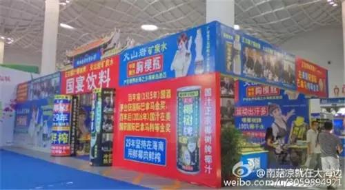
展位


集团门面
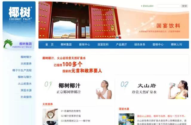
网站
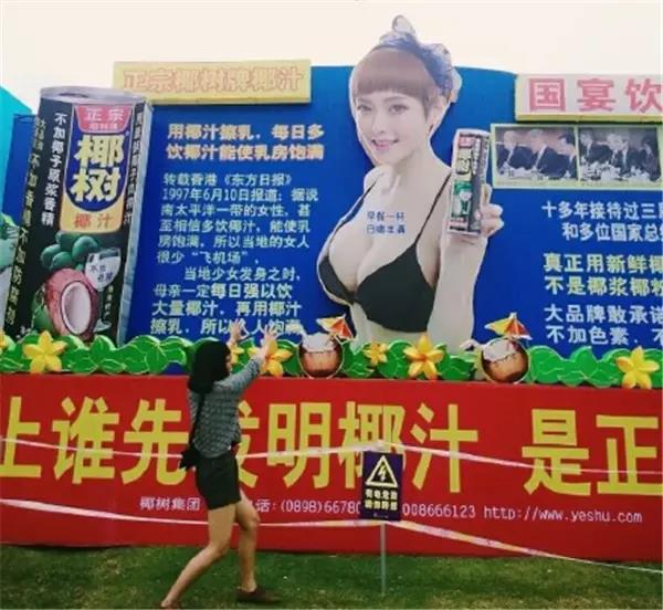
户外广告

.jpg)
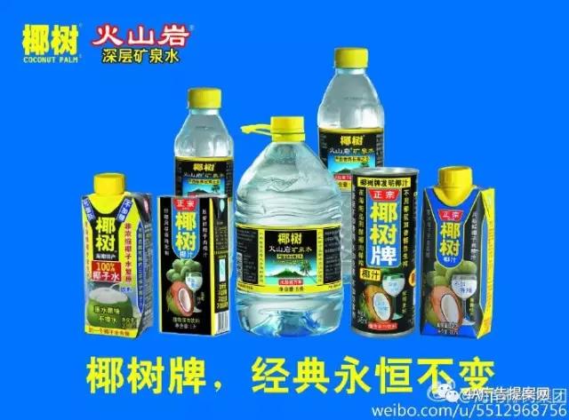
微博


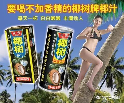
还有不变的身材
擦擦鼻血 完整版视频来了
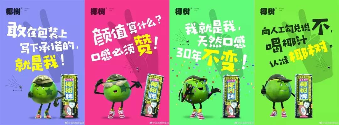
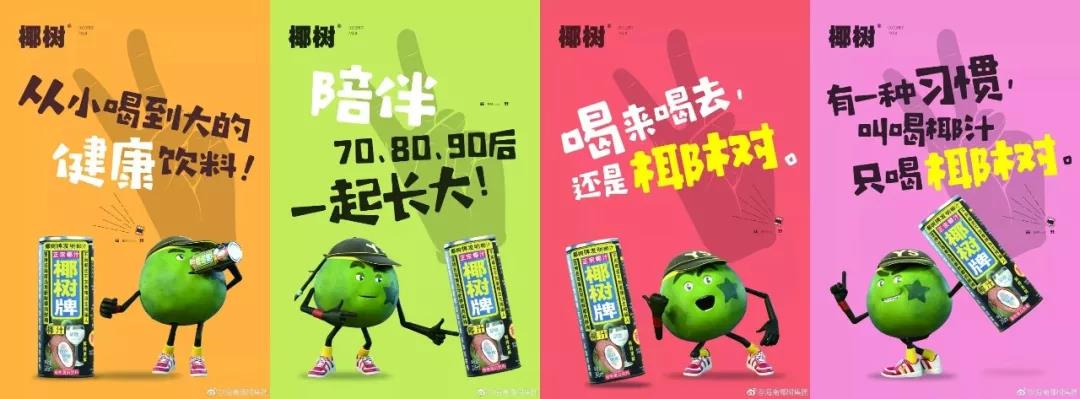
上次是因为画风突变
发布了一首《椰树style》
然后推出了一组“自然清新”海报,
全新的配色,全新的文案
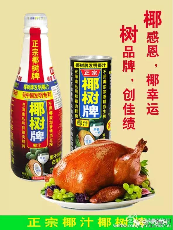
这几天椰树牌椰汁又火了
因为,换包装了!
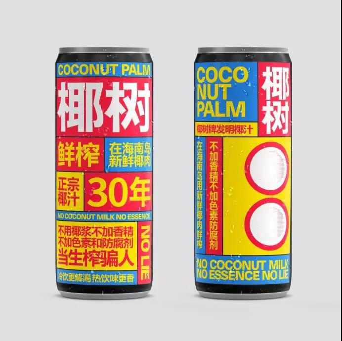
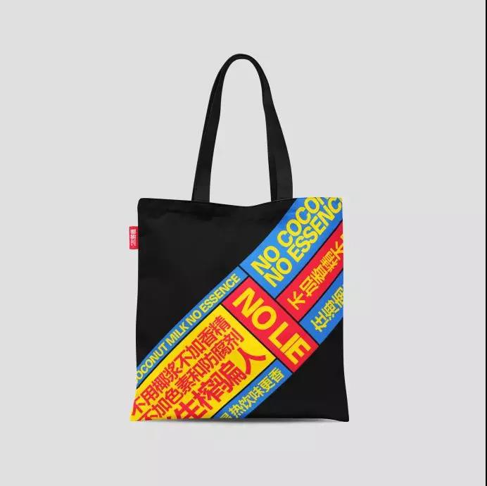
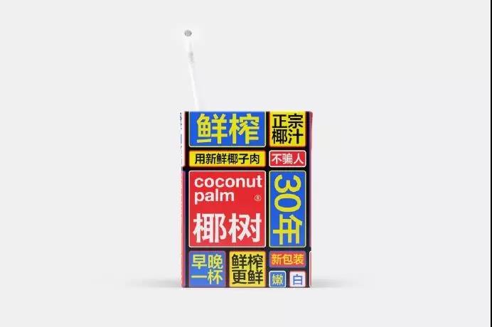
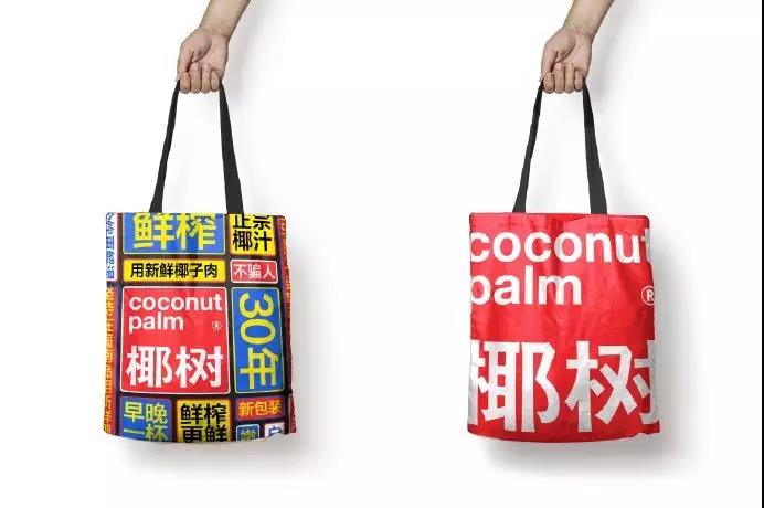
原来是知名设计师NodYoung带着学生做的一个虚拟设计项目,设计延续了椰树的一贯设计风格,字要大,颜色要鲜艳,只是调低了颜色的饱和度。
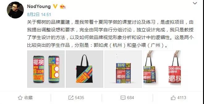
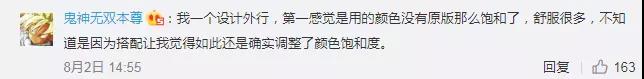
新设计一出,得到了许多网友的好评:


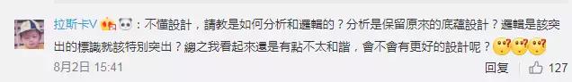
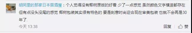
也有网友提出了质疑:
你觉得椰汁的新包装怎么样?
本文来源于广告记,仅用于交流学习,如有侵权,请联系我们删除。
武汉标志设计公司,武汉VI设计公司,武汉画册设计公司,武汉平面设计公司,武汉广告公司,武汉广告设计公司,品牌设计公司,平面设计广告公司